Walk into a room where the walls, ceiling, trim and even the joinery all wear the same beautiful tone, and something quietly wonderful happens. The edges soften, the space feels considered, and you feel held by the colour rather than boxed in by it. That look is called colour drenching, and it is one of the most talked-about ideas in interior design right now. At Brighton Homes, we believe a home should let life in, and colour plays an enormous part in that. This is our guide to what colour drenching is, where it works best, and how to get it right at home.
What Is Colour Drenching
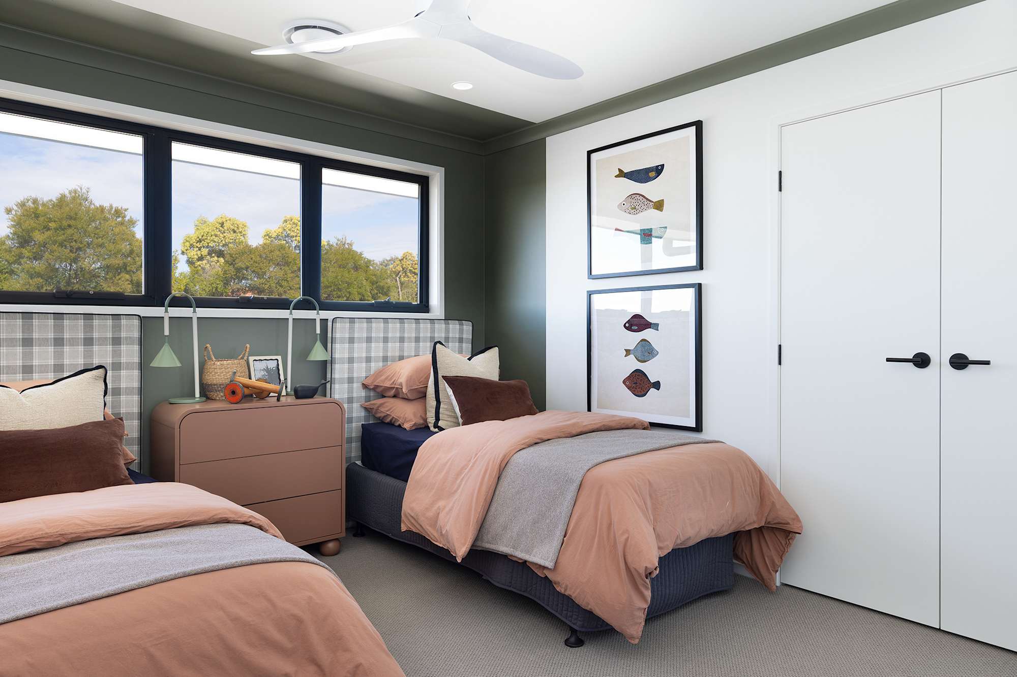
Colour drenching is the practice of taking a single colour (or a closely related family of tones) and carrying it across nearly every surface in a room: the walls, the ceiling, the cornices, the skirting boards, the architraves and often the doors and built-in cabinetry too. Instead of the usual recipe of coloured walls and crisp white ceilings and trim, a colour drenched room wraps the whole space in one continuous hue.
The Colour Drenching Trend In Interior Design
The colour drenching trend has surged as more of us move away from the all-white interiors that dominated the last decade. After years of pale, pared-back spaces, many homeowners are craving warmth, personality and mood, and colour drenching delivers all three. It forms part of a broader movement in contemporary interior design towards richer colour palettes and thoughtfully layered spaces rather than stark or clinical
While it feels fresh, the idea is not new. Tone-on-tone rooms have appeared in grand period homes for generations, where panelled walls and ceilings were often finished in the same colour. The current colour drenching trend simply reinterprets that history for the way we live today, pairing it with modern paint finishes and the open, light-filled spaces Queenslanders love.
Colour Drenching Versus Monochrome
It is easy to confuse a colour drench with a monochrome scheme, but they are not quite the same. A monochromatic room layers many shades of one colour: a pale tint on the walls, a deeper version on the sofa, a darker accent in the cushions. The interest comes from the contrast between light and dark within the same colour family.
A full colour drench, by contrast, keeps the same colour and the same depth across the room so the surfaces almost dissolve into one another. There is also a softer middle path, often called a layered-tone drench, where you stay within one colour family but allow the walls, trim and ceiling to shift slightly in shade for subtle contrasts and gentle visual breaks.
So which should you choose? Reach for a full drench when you want a bold, enveloping result and a real sense of occasion. Choose a layered-tone or monochromatic approach when you want the cohesion of one colour but prefer more depth. Neither is more correct; it comes down to the mood you want to create in your home.
Why Choose A Colour Drenched Room
The first reason is emotional. A colour drenched room feels immersive and intentional, and that can be deeply calming. A soft, earthy green can make a living area feel grounded and restful, while a warm terracotta can make a space feel welcoming and snug. Because your eye is not constantly stopping at a white ceiling line or a bright skirting board, the whole space reads as a single, peaceful, cohesive space.
The second reason is architectural. Drenching everything in one colour quietly emphasises the shape of a room. Beautiful architectural features such as arched doorways, a fireplace or a recessed nook are highlighted by the continuity of colour rather than competing with contrasting trim.
Finally, there is the effect on perceived space. When the walls, trim and ceiling share the same colour, the boundaries between them blur. The corners become harder to read, the ceiling can feel higher, and a small space can actually feel larger than it would with high-contrast white trim chopping it into sections.
Where Colour Drenching Works Best
Colour drenching is wonderfully versatile, but some rooms take to colour drenching especially beautifully. Here is where we love to see it.
Small Spaces And Hallways
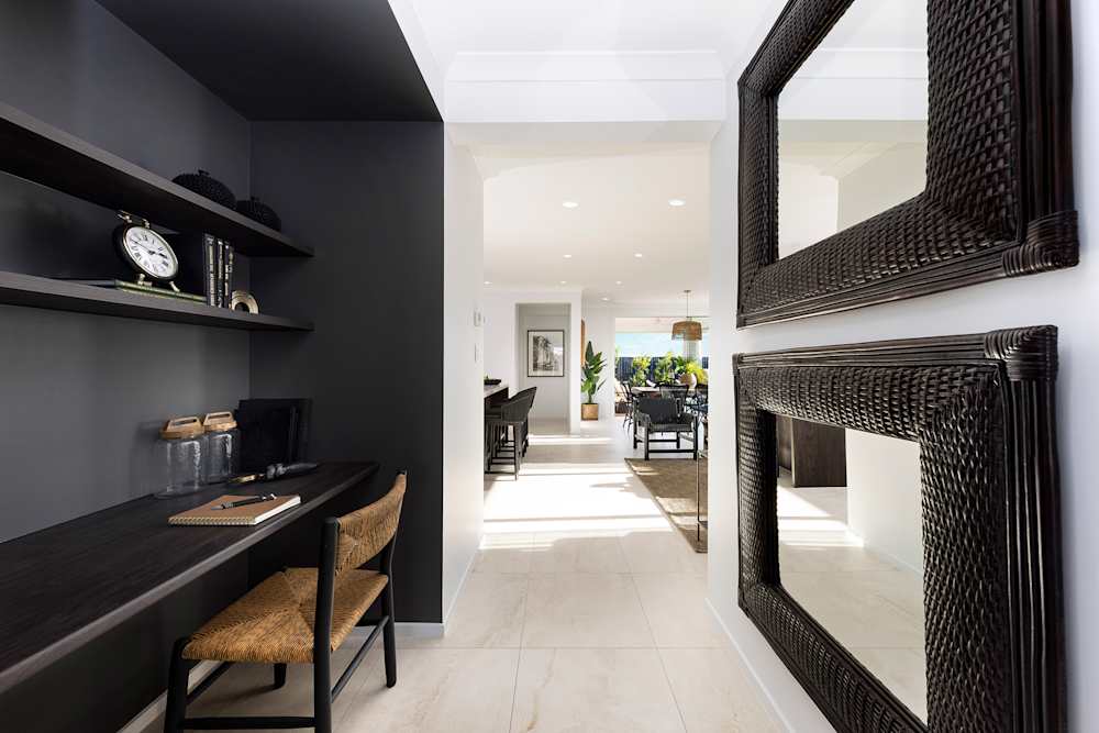
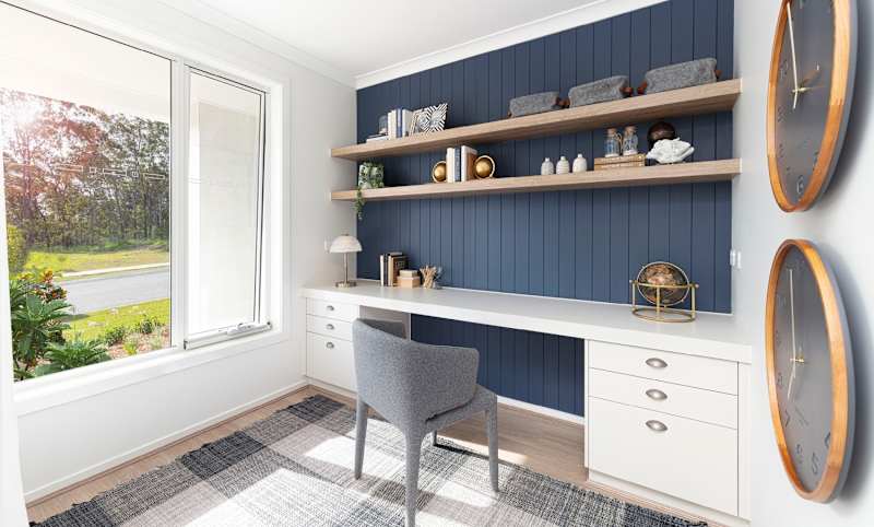
It can feel counterintuitive, but small spaces are some of the best places to try colour drenching. A powder room, study nook or hallway often has little natural light and lots of awkward angles and junctions. Drenching the whole space in one colour blurs those edges visually and turns a forgettable transition zone into a jewel-box moment that surprises and delights.
Living Rooms, Bedrooms, And Dining Rooms
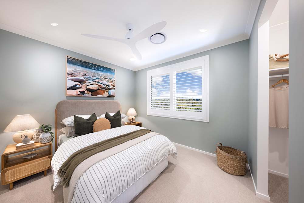
In a bedroom or a formal dining room, colour drenching creates a cosy, intimate atmosphere that feels intentional and grown-up. A deep, moody tone makes a dining room perfect for long dinners with friends, while a soft, muted shade can make a bedroom feel like a true retreat. In a main living area where you want to preserve openness, simply lean towards lighter tones of your chosen colour so the room stays airy while still feeling cohesive.
Bathrooms And Home Offices
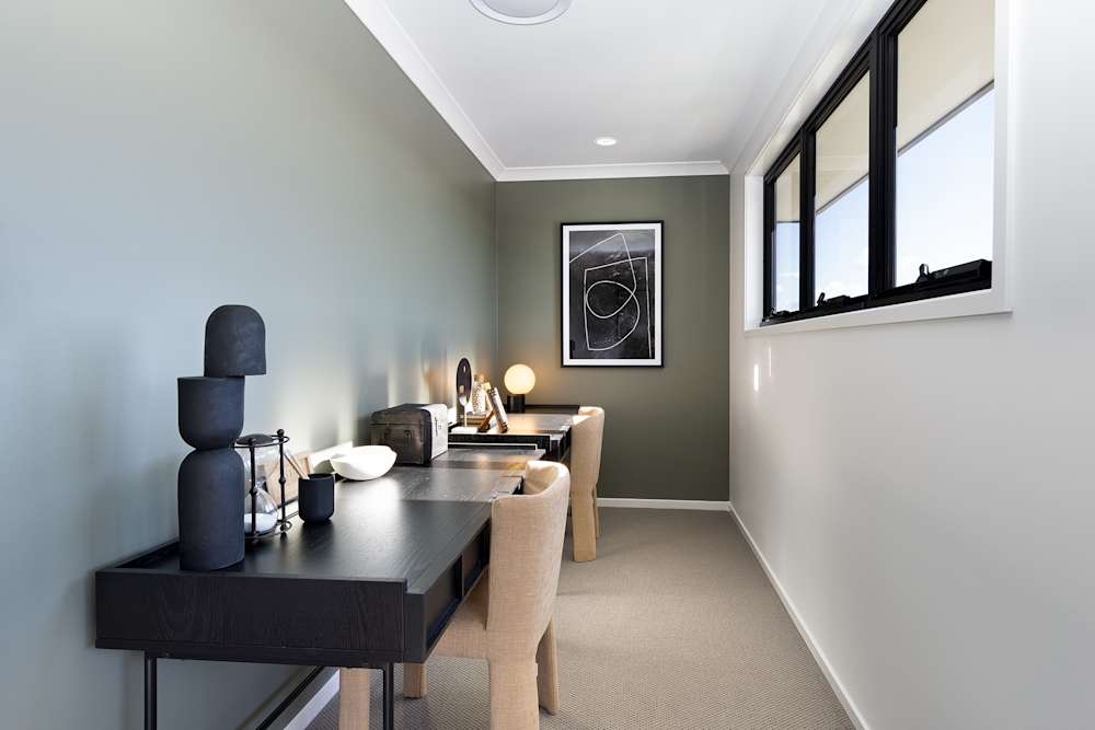
Drenching a bathroom in a single rich colour gives it a luxurious, hotel-like feel, especially with quality tapware and considered lighting. In a home office, calm, balanced mid-tones such as sage green, muted blue or warm greige help create a focused, productive setting without feeling flat or sterile.
Colour Selection
Choosing the right colour is the heart of a successful drench. As a general guide, dark colours such as charcoal, ink blue, forest green and chocolate create a cosy, cocooning effect that wraps a room in atmosphere; they are ideal for spaces where you want drama and intimacy. Light colours such as soft whites, oatmeal, blush and pale sage do the opposite, enlarging the perceived space and keeping it open and serene.
If you love a statement, bold palettes such as a saturated olive, a rich rust or a deep plum deliver maximum dramatic impact and real personality. Whatever you choose, the single most important rule is this: always test your chosen colour on-site before you commit. Paint large sample patches on more than one wall and live with them across a few days, because the same shade can look completely different once it is on your own surfaces, in your own light.
Paint Finish And Texture Strategies
Colour is only half the story; finish and texture bring a colour drenched room to life. As a rule of thumb, a matte finish works beautifully across large surfaces such as walls and ceilings, because it absorbs light, hides minor imperfections and gives that soft, enveloping look that makes drenching feel so considered.
From there, you can introduce contrast through sheen rather than colour. A gloss or satin finish on selected joinery or a door creates subtle highlights and catches the light, while keeping everything in one hue. Using a different sheen on trim and walls creates gentle definition, and for even more depth, wallpaper in a matching tone or a textured plaster finish adds another layer of richness.
Where Colour Drenching Works Best
Colour drenching is wonderfully versatile, but some rooms take to colour drenching especially beautifully. Here is where we love to see it.
Small Spaces And Hallways
It can feel counterintuitive, but small spaces are some of the best places to try colour drenching. A powder room, study nook or hallway often has little natural light and lots of awkward angles and junctions. Drenching the whole space in one colour blurs those edges visually and turns a forgettable transition zone into a jewel-box moment that surprises and delights.
Living Rooms, Bedrooms, And Dining Rooms
In a bedroom or a formal dining room, colour drenching creates a cosy, intimate atmosphere that feels intentional and grown-up. A deep, moody tone makes a dining room perfect for long dinners with friends, while a soft, muted shade can make a bedroom feel like a true retreat. In a main living area where you want to preserve openness, simply lean towards lighter tones of your chosen colour so the room stays airy while still feeling cohesive.
Bathrooms And Home Offices
Drenching a bathroom in a single rich colour gives it a luxurious, hotel-like feel, especially with quality tapware and considered lighting. In a home office, calm, balanced mid-tones such as sage green, muted blue or warm greige help create a focused, productive setting without feeling flat or sterile.
Colour Selection
Choosing the right colour is the heart of a successful drench. As a general guide, dark colours such as charcoal, ink blue, forest green and chocolate create a cosy, cocooning effect that wraps a room in atmosphere; they are ideal for spaces where you want drama and intimacy. Light colours such as soft whites, oatmeal, blush and pale sage do the opposite, enlarging the perceived space and keeping it open and serene.
If you love a statement, bold palettes such as a saturated olive, a rich rust or a deep plum deliver maximum dramatic impact and real personality. Whatever you choose, the single most important rule is this: always test your chosen colour on-site before you commit. Paint large sample patches on more than one wall and live with them across a few days, because the same shade can look completely different once it is on your own surfaces, in your own light.
Paint Finish And Texture Strategies
Colour is only half the story; finish and texture bring a colour drenched room to life. As a rule of thumb, a matte finish works beautifully across large surfaces such as walls and ceilings, because it absorbs light, hides minor imperfections and gives that soft, enveloping look that makes drenching feel so considered.
From there, you can introduce contrast through sheen rather than colour. A gloss or satin finish on selected joinery or a door creates subtle highlights and catches the light, while keeping everything in one hue. Using a different sheen on trim and walls creates gentle definition, and for even more depth, wallpaper in a matching tone or a textured plaster finish adds another layer of richness.
Inspiration And Palette Ideas
If you are drawn to a dark, moody palette, consider a deep forest green across a study, a charcoal or ink blue in a media room, or a rich chocolate in a formal dining space for real warmth after dark. If a light, airy feel is more your style, soft oatmeal, warm greige, gentle sage or a barely-there blush keep a room serene while still feeling cohesive and considered.
For the adventurous, there is also double-drenching, a creative variation where two related colours are carried through adjoining spaces so that one room flows into the next while each retains its own character. It is a beautiful way to connect open-plan zones. For more rooms to fall in love with, browse our Home Inspiration gallery, and if you would like guidance on choosing the underlying colour for your drench, our blog on how to choose interior paint colours is the perfect next read.
Final Checklist Before You Commit
Before you lift a brush, run through these last few checks. Test large swatches on multiple walls and live with them for several days. Confirm your colour's undertone is compatible with your fixed furniture, flooring, tiles and benchtops. Decide which surfaces will be drenched and which finishes you will use on each. And plan ahead for the future, keeping leftover paint and bearing in mind how easily the scheme could be refreshed or changed down the track.
Colour drenching is one of the simplest ways to give a room a genuine atmosphere and a sense of thoughtful design. The best way to see it in person is to experience it for yourself. Visit one of our display homes across South East Queensland to see how considered colour, light and finishes come together in a Brighton home, and start imagining the spaces where you will let life in.